'Entitled parent' says airline moved their toddler's seat right before flight took off
This wasn't your typical 'entitled parent' story.
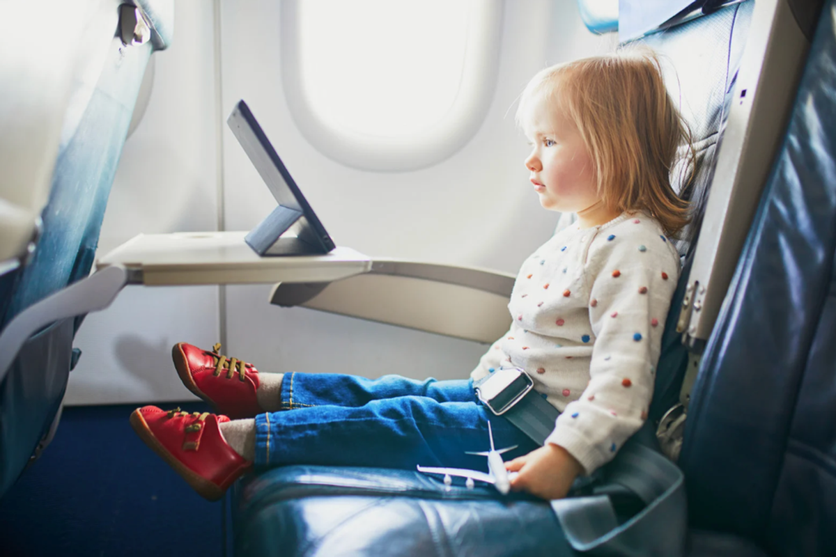
A child sits alone in a plane seat.
I took a long Amtrak train trip from Atlanta to Baltimore with my nine-year-old daughter this summer. As far as I could tell, there was no way to reserve specific seats in coach on our particular train ahead of time. But we arrived as early as we could and, to our delight, were treated to a near-empty train. We sat together in a two-person row and had a really nice trip up to Baltimore.
On the way back? We boarded at Union Station and the train, having arrived from New York, was already packed. The conductor told me he would try his best to seat us together but couldn't guarantee it. You should have seen the terror in my daughter's eyes. It would be a 14-hour overnight train ride. Sitting her next to some stranger that whole time? Absolutely not. No way.
They eventually found us seats across an aisle from each other, which kind of worked, but wasn't ideal. Luckily, the guy I was supposed to sit next on the other side flew into a rage that he wouldn't have a row to himself and stormed off to sit elsewhere, freeing up the row for us.

But for a few horrible minutes, I had become "that dad" desperately asking anyone in the area if they'd be willing to move so we could sit together.
I had become the dreaded "entitled parent" from all the viral travel stories.
Stories of "entitled parents" desperately trying to get other passengers to switch seats go viral all the time. But a recent thread on Reddit shows why we don't always get the full story.

in a since-deleted post, user u/takeme2themtns shared a nightmare travel story in the r/Delta subreddit:
"In typical Delta fashion, they just switched up our seats and placed my toddler in a row away from us," they wrote. "Booked three seats ... in comfort plus months ago. Now, several hours before the flight we get notifications that our seats have changed. They put wife and me in exit row seats and the toddler in a window seat a row away."
With no way to fix the seating snafu digitally, the OP would have to rely on the Gate Attendant or even Flight Attendant to make a last-minute change—which would force someone else on the plane to move.
"I’m confident the GA (gate attendant) will take care of it," they wrote, "but it’s still so frustrating that we have to worry about it. I know we see posts like this all the time, but that’s because it happens all the time to people. Delta needs to fix this trashy system."
- YouTube youtu.be
Another user in the comments wrote to share a similar story:
"I had this happen to me. The check-in person said to talk to the gate.
The gate said to talk to the flight attendant.
The flight attendant told me to ask people to trade seats.
I asked people. People said no. Other passengers started berating me for not planning ahead and saying my lack of planning isn’t their responsibility.
I defended myself by saying I reserved seats months ago and Delta moved me at the last minute. Then passengers started yelling at each other about my situation.
The FA had someone move and I got to sit with my daughter."
The user noted that the situation was chaotic and traumatizing.
These stories are far from rare.

I found another story just like this on the r/United subreddit. The user's family booked seats together only for the system to separate them right before the flight, leaving an eight-year-old to fly seated alone. The flight crew's only solution was to ask other passengers to switch, causing the OP's family to get lots of dirty looks for the duration of the flight.
Having a young child or toddler seated away from you while traveling is just a complete no-go for many, many reasons. But as a dad, leaving a kid of nearly any age to sit alone—even if they're 8 or 10 or 14—is not acceptable.
And it's not just about convenience—it's a huge safety issue. There are plenty of horrifying news stories that support why a parent would do absolutely anything to avoid it.
When we hear these stories, they're almost always framed as the parents being unprepared, lazy, and entitled. But maybe we're missing the point.

A story from January 2024 praises a passenger who refused to switch seats with an "entitled dad" as a "hero."
People are fed up with parents asking them to switch out of airline or train seats that they paid good money for. And I don't blame them!
But we need to stop beating each other up and start holding the airlines and other travel companies accountable for putting parents and non-parents into this mess in the first place.
There needs to be a better system for families booking plane and train tickets. When you buy tickets, you have to enter in the ages of the children you're traveling with — so it stands to reason that these mix-ups flat out shouldn't happen!
Families shouldn't have to panic at the gate or on board about this! Other paying passengers shouldn't have to give up their seats!
The good news is that the Department of Transportation has recently gotten involved with a dashboard of which airlines guarantee family seating at no additional cost.
The DOT is looking to even make it illegal for airlines to charge parents and children fees to sit together. Parents and children under 13 would be required to be seated side by side or immediately adjacent, and if not, they'd get a full refund or free rebooking—it's known as the Families Fly Together Act.
Traveling in 2025 is stressful enough, from seat changes to unruly passengers to high numbers of cancelled flights.
Seating kids and parents together seems like one small problem we should be able to solve.
This article originally appeared last year.

