We often view the 90s as a golden era of optimism, a “simpler” time when we weren’t so disconnected by technology, when the economy was booming and the cultural landscape was rich in great music, movies, television, you name it.
But, as with any decade, there were a great many cons to go along with those pros. Folks who were adults (or at least close to it) during the 90s can easily recall plenty of darker moments. So when they were asked, "What was bad about the '90s?" people didn’t hold back.
Interestingly enough, there weren’t as many mentions about the shifting political landscape—the paranoia set in from 9/11, the Gulf War Recession (which paved the way for Bill Clinton winning the presidency), Rush Limbaugh laying the groundwork for Fox News and thusly the Republican Party we know today, etc.—but rather, people focused on how day to day life felt.
1. For one thing, as folks mentioned, 90s diet culture was…intense. Let’s not forget that the word “heroine chic” was coined (and normalized!) during this era. And because thinness was the only body type deemed “attractive” by the media, it led to some really questionable foods that were somehow deemed healthy. Of course, diet-obsessed or not, a lot of foods that were mainstream at the time are now a bit perplexing.
"Female celebrities were shrinking to child sizes and getting praised for it. 'Thinspo' was a thing. ALL my friends group from high school and college, including myself, had eating disorders — Marlboro Light and Diet Coke for every meal. Our idea of sports was extreme cardio only. We were SO unhealthy. Thank God we were young enough to bounce back to normal without major issues."
"Maybe it was my house, but everything was 'low-fat' or 'non-fat' and tasted like sh*t. As it later turned out, the fat wasn't the problem but the sugar they put in everything."
"The 'poison food' era — full of dyes, sugar, preservatives, and artificial ingredients, packaged and microwaved in plastic for your convenience. The nutritional guidance was so bad it kicked off an obesity epidemic we’re only solving now, thanks to breakthrough medication."
2. And let’s be honest, women were not only dealing with terrible beauty standards, but misogyny as well.
“I was grabbed in various situations, pushed in corners, kissed involuntarily from the time I was 11 years old, etc. As a girl, you just had to live with it. "
"Belittling, discouraging comments towards women, especially young ones, were normal; society expected its women to be pretty and available at all times but saints and virgins in their minds and bodies. So, basically, like today."
"There was a lot of media pitting girls against girls and framing other women as competition, not friends."
"People would say the most unhinged things about my (and others') looks and hobbies, and it was socially acceptable for them to do so. It was wild that being a mean girl was encouraged. I’m so glad we’ve moved past that as a society; the '90s were a brutal time."
3. Life wasn’t so great for the LGBTQ community either.
"Between AIDS, 'don't ask, don't tell,' the Defense of Marriage Act, Matthew Shepard's murder, etc., coming out of the closet was scary as hell. We made some gains, and it felt like we were closer to acceptance, but there was so much backlash and fear."
"Growing up as a queer kid in the '90s meant I had no LGBTQ+ role models to look up to, so I learned to lie about myself in order to survive. I came out when I was in high school in the early 2000s, and more than half of my 'friends' stopped talking to me.
In middle school in the late '90s, the school psychologist tried to force me to come out so she could shame me in front of my parents. She also interviewed all my friends to try to find out if I ever acted 'gay' around them and even wanted to know if I had ever tried to kiss them; the school knew all about this. One of my friends was sent to a conversion camp, and we didn't hear from him again until Facebook became popular.
I sometimes still wonder how the hell I survived, but I'm glad I did."
“Where I grew up in the 90s we used homophobic slurs all the time to describe basically anything we didn't like for any reason. I did, everyone else did, it was just completely ubiquitous.”
4. People were also quick to note how drastically different attitudes were towards mental health. We might have seen the beginnings of shifts towards community-based care, increased focus on medication, and growing efforts to reduce stigma at this time, but it was still a stark contrast to the openness of conversation and access to resources that we have today.
"Being a child diagnosed with autism in the '90s, I was lumped in the special education classes despite not needing them, and it sucked. Back then, anyone who was autistic was typically thought of as 'slow.'"
"I never heard the words anxiety, depression, coping strategies. Everyone in my family was drinking their feelings away and denying the feelings existed."
"Mental health support was still stigmatized as something only 'crazy' people got. My dad died in '97, and I had a complete psychotic breakdown in '99. My mom cried while asking if I wanted to see a psychiatrist. Going to therapy was viewed as a death sentence."
5. On the subject of health, let’s keep in mind that smoking indoors wasn’t banned until the late 90s/2000s. And drunk driving? Pretty damn acceptable.
- YouTubewww.youtube.com
"Cigarette smoke was everywhere — stores, malls, you name it. Smoking sections in restaurants were sometimes on the left side of an aisle as if that helped. It was so weird when my parents quit smoking because I stopped being nose blind to the smell. That sh*t REEKS."
"When I was a teenager, we moved, and while packing, we removed the pictures on the wall and noticed white squares left where they had been hung. The change was so gradual that none of us noticed it — so nasty. Until that point, both of my parents previously stopped smoking IN the house but still smoked elsewhere. That was the final straw that caused my father to fully quit."
"Drunk driving didn't have the stigma it does today. It took a long campaign waged by MADD (Mothers Against Drunk Driving) to shift public perception on how dangerous drunk driving is."
"When I was a child, we had a group of family friends whose kids were all around the same age. The parents would throw house parties, taking turns hosting and partying hard while the kids played. At the end of the night, they’d all load the kids in the car and drive home absolutely hammered. Everyone was like this—not just my parents’ friend group. I’m sure it still happens today, but I haven’t seen it."
6. Raising kids in the 90s certainly had its cons, as comments mentioned the media-fueled fear of child abduction, prevalence of child abuse, gang violence, and the first school shootings.
"Columbine deeply altered my worldview. I was a kid in the '90s, and until 1999, at the age of 13, I was never concerned about a school shooting — it just wasn’t a thing…I went 13 years without the remote concern of a school shooter. Who can say that now?"
"The constant fear of being kidnapped. My mom always told my sister and me to stay close to her when we were out because too many kids were getting taken. I remember seeing posters of missing children at the supermarket, and it was sad and scary."
"Gangs were rampant in the 90s — everywhere. I grew up in a suburb, but we still had ESL, aka 'Bloods,' Crypts, New Wave, Skinheads, etc., represented. Kids were pressured into joining these gangs when they were young. I witnessed my first major gang fight in eighth grade when thirty kids began brawling after school. The next Monday, I had friends on crutches; one kid got sliced with a knife, thankfully not deep, and four others had broken bones in their hands, etc. No one talked to anyone about anything, so there were no suspensions."
"If a parent grabbed a kid by their hair, hit them, or screamed obscenities at them, the public at large would just mind their business or even jump in to defend the parents' 'right to discipline,' and teachers were allowed to beat us at school. Any adult could hit a child, and people would just stand there and agree with it. Most friends I had growing up were 'latchkey' kids and neglected at home from super young ages. They had to walk home from elementary school, cook dinner for themselves, feed their siblings, and care for the house. Parents didn’t seem to care about their kids. At night, commercials asked: 'Did you hug your child today?' And 'It’s 10 p.m. Do you know where your child is?' Those commercials/PSAs started decades before, but they continued throughout the late '90s."
7. While the 90s was obviously a pivotal moment for technology, most cutting edge items weren’t fully accessible to the general public. There are just many modern-day conveniences we take for granted now.
"If your family lived in a rural area and wasn't rich enough to immediately buy a computer, you could be lonely in a way that people can't even comprehend now. I spent the last two years of high school doing nothing, watching TV and playing 16-bit RPGs repeatedly because I couldn't get anywhere or do anything."
"And yes, I know that sounds super chill nowadays, but back then, it could be very depressing — especially when you knew that the kids who had cars were going to concerts and coffee houses while you were just home alone doing nothing. It was maddening."
“Nothing was chargeable. You needed batteries.”
“It may sound strange but not having cell phones meant if you planned to meet someone somewhere and they were late, you had no idea if they were just around the corner or going to be an hour late or at the wrong place and you had to just stand there staring into space because you didn't have reddit to scroll through while you waited.”
“One of my best friends from grade school moved away. He wrote his phone number down on a piece of paper so we could keep in touch. I lost it. Never spoke to him again because I had no way to contact him.”
8. Lastly (and this one might hurt for Kurt Cobain fans) not everyone was a fan of 90s music.
"Everyone loves the music from the '90s, but it’s all so bleak. Most of the grunge bands were singing about addiction, severe depression, and barely coping. I think a lot of that bled into mainstream society. The 'alternative' music scene was rife with gut-wrenching lyrics.""
"I was in high school/college then, and I can’t go back and listen to bands like Alice In Chains, Mad Season, Nirvana, and Pearl Jam anymore. Back in the day, I listened to it constantly, and I loved it, but in hindsight, I think it harmed my psyche. Thank God I found The Grateful Dead when I did."


 University Of Washington Dog GIF by Pac-12 Network
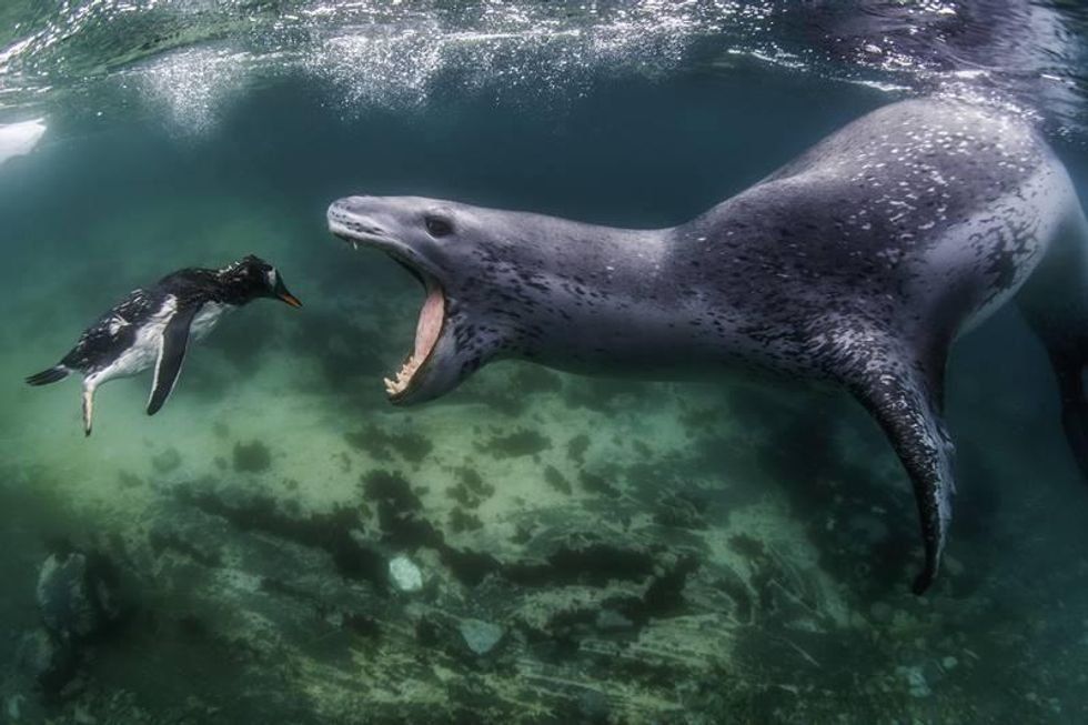 World Nature Photographer of the Year and Gold Winner in "Behavior - Mammals" — Amos Nachoum, USA
Amos Nachoum/World Nature Photography Awards
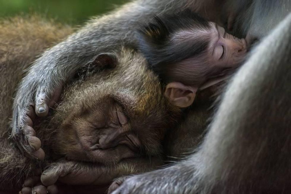 Gold Winner in "Animal Portraits" — Tom Vierus, FijiTom Vierus/World Nature Photography Awards
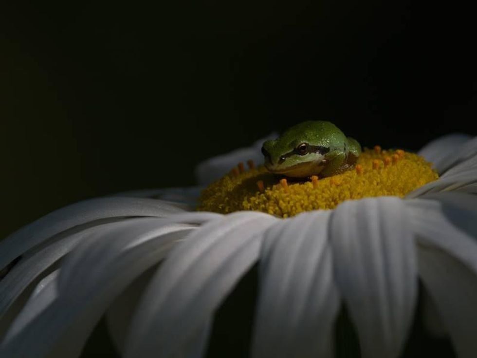 Gold Winner in "Behavior - Amphibians and Reptiles" — Shayne Kaye, CanadaShayne Kaye/World Nature Photography Awards
 Gold Winner in "Behavior - Birds" — Ashok Behera, Indiavia Ashok Behera/World Nature Photography Awards
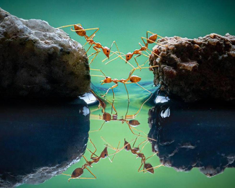 Gold Winner in "Behavior - Invertebrates" — Chin Leong Teo, Singaporevia Chin Leong Teo/World Nature Photography Awards
 Gold Winner in "Nature Art" — Federico Testi, ItalyFederico Testi/World Nature Photography Awards
 Gold Winner in "People and Nature" — Sabrina Inderbitzi, SwitzerlandSabrina Inderbitzi/World Nature Photography Awards
 Gold Winner in "Plants and Fungi" — Gautam Kamat Bambolkar, IndiaGautam Kamat Bambolkar/World Nature Photography Awards
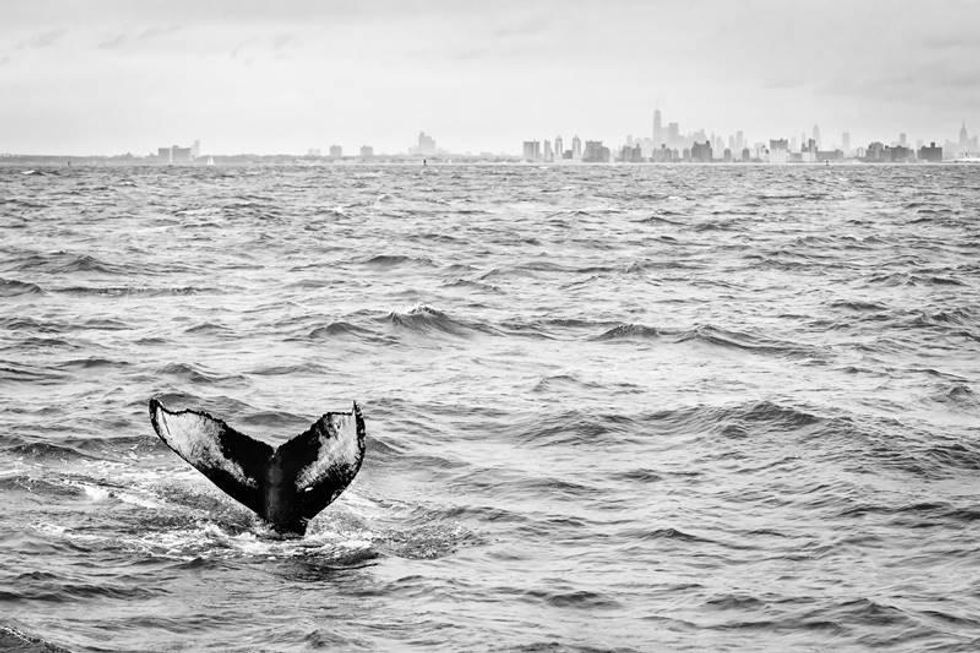 Gold Winner in "Urban Wildlife" — Matthijs Noome, USAMatthijs Noome/World Nature Photography Awards
 Gold Winner in "Planet Earth's Landscapes and Environments" — Sam Wilson, AustraliaSam Wilson/World Nature Photography Awards
 Gold Winner in "Black and White" — Vince Burton, United KingdomVince Burton/World Nature Photography Awards
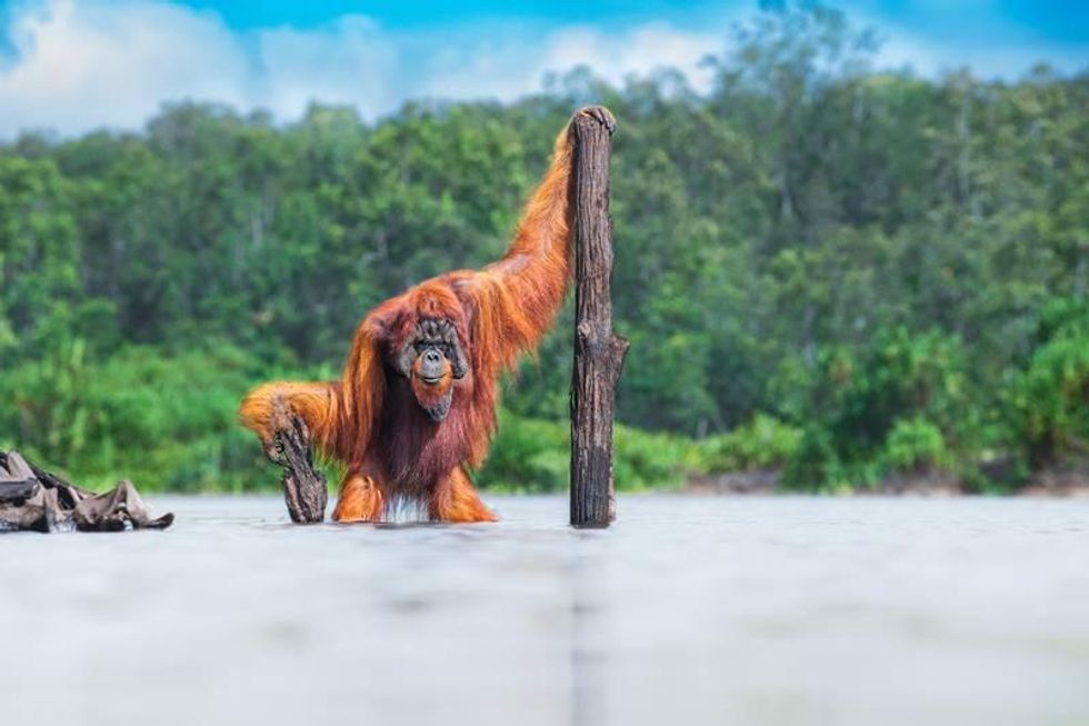 Gold Winner in "Animals in Their Habitat" — Thomas Vijayan, CanadaThomas Vijayan/World Nature Photography Awards
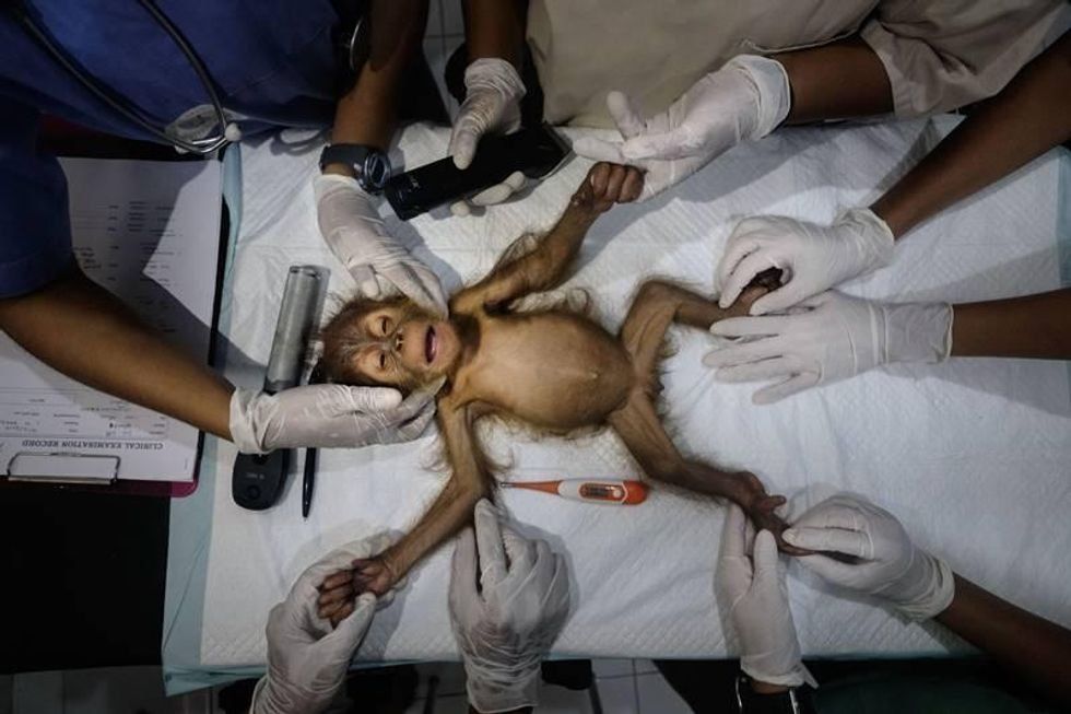 Gold Winner in "Nature Photojournalism" — Alain Schroeder, BelgiumAlain Schroeder/World Nature Photography Awards
 Crow GIF
 crows GIF
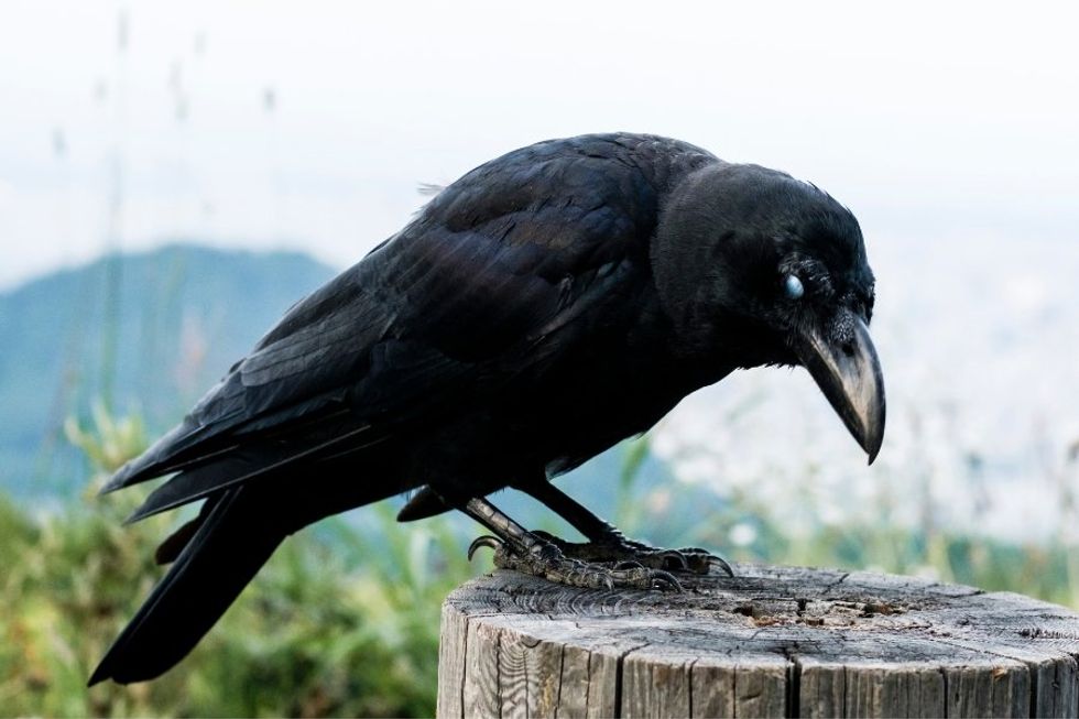 Crows are some of the most intelligent birds on Earth.
 Sung to the tune of "Celebrate."
 Sung to the tune of "All of Me" by John Legend.
 Sung to the tune of "Losing My Religion" by REM.